During the 1950s, Pantone set up in New Jersey as a commercial printer. In those days, printers used guesswork to match clients’ colours on the press, with varying results. You know the score if you’ve ever stood over a press in Milton Keynes at two in the morning.
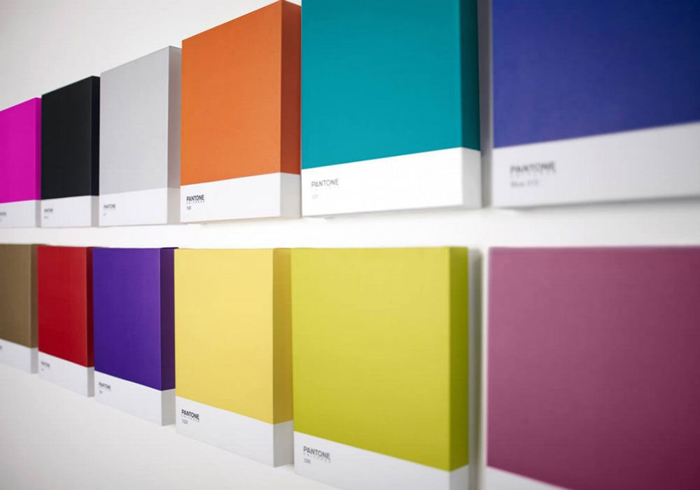
The company recognised how important it was to get shades consistently the same for the branding process, and they began classifying their pigment stock. In 1963, the printer produced their first Color Matching System – the curiously addictive swatch cards that designers used to fan out authoritatively and refer to CMYK references, knowing that account handlers would fall into reverent silence. For the next 30 years, Pantone was the preserve of graphic designers, practically unknown outside ad agencies and printers.
Pantone diversifies into consumer products
By the 1990s, Pantone was the market leader in colour matching and on its way to becoming a global brand. The company began to look at different ways of diversifying its business – and bring a palette of 1,757 colours to the general public. After all, colour is everywhere; owning it in terms of branding is a powerful position to be in.
Their ‘Pantone Universe collection’ of consumer products springs from creative partnerships with carefully chosen and managed licensees in over 100 countries that take in everything from fashion and home to the graphic arts and architecture.
They ventured into technology with the brilliant Sharp Pantone 830SH mobile phone in 15 dazzling colours; into household paint with high-quality US manufacturer Fine Paints of Europe; and infiltrated the home with chairs, mugs, salt and pepper mills, kitchen canisters, cushions, stationery and so on. They clearly hit the heights when they made an outfit for Barbie, chairs for Seletti, clothing for Gap and Uniqlo, Moleskine notebooks, watches for Swatch, Nike trainers, carpet for The Mohawk Group and a genius Rubik’s cube that was just shouting out for the Pantone treatment.
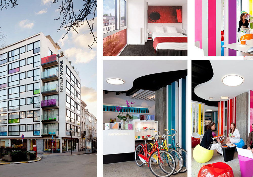
And from consumer products, it was a short sidestep to opening the Pantone Hotel in Brussels in 2010, showing off their expertise in 59 rooms that are each inspired by different Pantone colour palettes. Naturally, you can buy into all their plentiful product collaborations while you’re there.

Global brand Pantone opened ‘The Pantone Colour Hotel’ in Brussels
Thought leader: Color of the Year
The brand shows no signs of slowing their global domination, while retaining their original authority. So each year since 2000, they have declared a ‘color of the year’ that reflects the prevailing trends: this year, the honour goes to Tangerine Tango (or Pantone 17-1463 TCX for purists), a peppy red-orange that ‘gives an instant energy boost’. And they’ve swiftly applied it to a makeup line created with Sephora, a blaze of Tangerine Tango-hued false lashes, nail lacquers, cream, glitters and high-pigment lip glosses.
It’s a fascinating case study of a brand that has retained real gravitas in a technical field, but has also become an incredibly populist household name.
They must be tickled pink. Or PMS 219.


