Fonts are the unsung heroes of the design world, communicating messages about brands that consumers pick up in milliseconds – and don’t even notice. Luxury brands need to be especially careful with the fonts they use – and make sure they conform to their personality and tone.
We’ve finishing reading Just My Type by Simon Garfield. It’s a book about fonts. No, not in a boring, geeky way. Really. It’s a rollicking ride through the world of printing, type and what fonts have been communicating to us subliminally since Gutenberg made the first typefaces in the 1440s.
Who knew that Barack Obama opted for Gotham to proclaim his supremacy in the elections, reflecting in its straightforward boldness, honesty and openness? Or that Londoners have been staring at the distinctive Johnston Sans since 1916 on the Underground – the font known for the perfect circle of its O? Or even that the Parisian Métro can’t quite make its mind up, shifting from the swirly Art Nouveau lettering to the all-cap Alphabet Metro and then to Parisine, a blocky modern font that you can’t help feeling will be out of date quite soon. Like by next year.
We love type. We respect how fonts convey information subliminally. Like the cover artwork to John Gray’s bestseller ‘Men are from Mars, Women are from Venus’ that neatly uses a masculine typeface (Arquitectura) for the male line, and a feminine one (Centaur) for the female one. Simple but very effective.
Creating character with fonts
It’s fascinating when you turn to how brands can use fonts to communicate their character. Absolut’s dark blue bold logo has smooth rich lines and implies luxury, while Ben Sherman’s hand-written font is immediate, quirky and non-corporate. Lyle & Scott and Burberry convey their long history with serif fonts (ones with curly bits at the bottom), along with the British Museum’s Baskerville, a typeface that dates back to the 1750s when the museum was also founded.
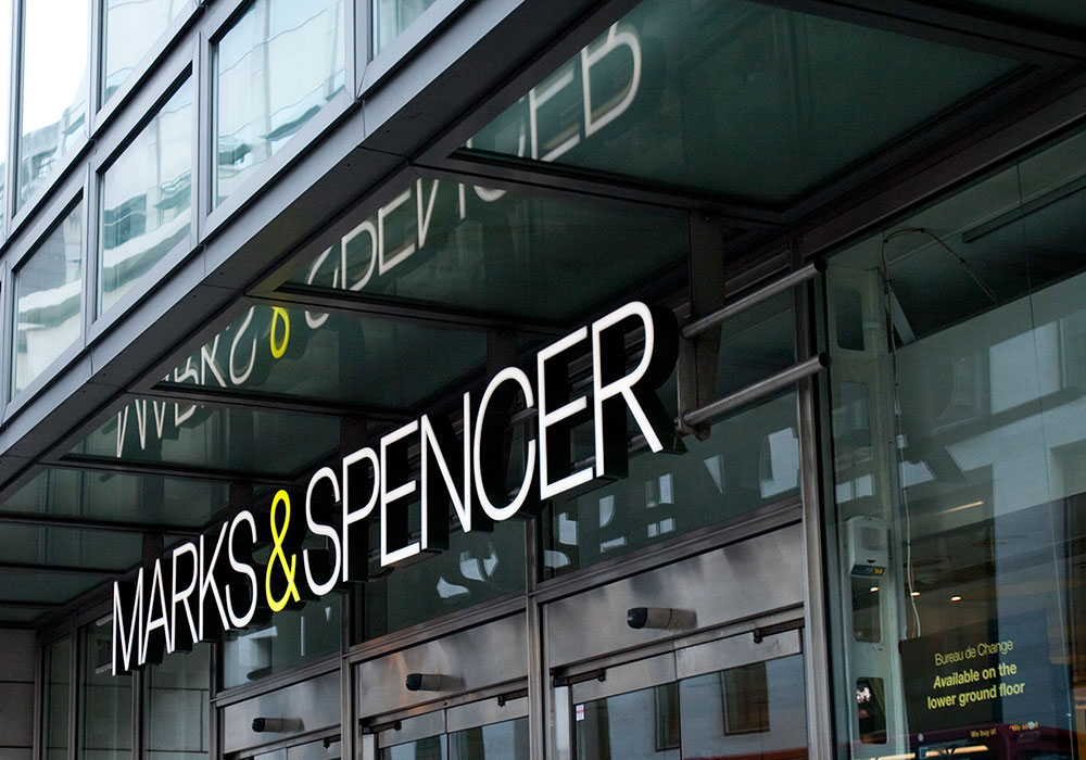
Other brands choose to project a clean, baggage-free identity with sans serifs, like French Connection and LG – as well as sports brands such as Nike, Adidas and Puma, who all convey power through their simple, chunky lettering. Some brands are more problematic: Marks & Spencer changed their familiar logo to a modern, pencil-thin typeface in an attempt to update their image, and succeeded in junking their heritage – and any warmth – in the process.

M & S updated their image by changing to a cleaner and more modern typeface design
Luxury brands and type
At SO, we work mainly with luxury and premium brands, who need to be extremely mindful about what their personality communicates. The supreme confidence of power-brands Gucci, IWC and Rolls-Royce is shown in the way they pare their logos down to the minimum, commissioning fonts that are clean, classic and timeless.
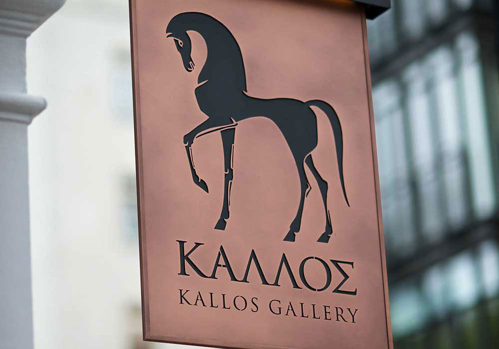
The branding we created for Kallos Gallery recently was a great case in point. We agonised over the logo and house font, as the brand is an ultra-high-end purveyor of antiquities in Mayfair. We added definition and texture to the brand’s horse motif, choosing Trajan, a clean and confident serif font for the logo and heading text in advertising and on the website. It’s easy to read and classic, but not old fashioned or ponderous. It breathes quiet luxury with authority and style.

‘Trajan’ is a classic typeface which worked perfectly to convey elegance, class and power to the Kallos luxury brand. It is well used particularly within the film industry because is conveys a sense of grandeur. Based on the inscription at the base of Trajan’s column in Rome, it has long been a popular typeface and the classic letterforms add a sense of stately elegance to the Kallos message.
Typography is a real artform, distinguishing eras (Art Deco vs 70s), attitude (Dr Martens vs Christian Louboutin) and where you sit in the market (WH Smith vs Harrods). And fonts can bring out strong emotions in people. In Just My Type, author Simon Garfield puts poor Comic Sans through the mill. The most maligned font in the history of printing was boosted in popularity due to non-designers getting their hands on a PC and tinkering. Office workers use it when they want to be a bit informal or friendly in emails and on posters. www.bancomicsans.com is a website devoted to promoting the sanctity of typography – and stopping the spread of every designer’s most hated font.
Garfield even has a joke up his sleeve: Comic Sans walks into a bar and the bartender says, “We don’t serve your type.” So there.
Image credit: ‘Luxury’ made with Paris Pro Typeface by Moshik Nadav Typography


